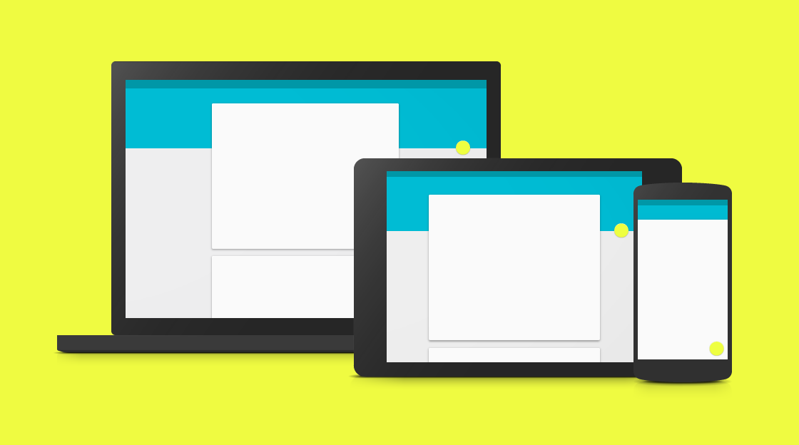
Web design trend spiked in the late 2013 as the first ever simplistic design was unveiled to the world, the Flat Design. The design instantly touch the heart of the users around the globe due to its minimalist look and feel, neat interface, more white spaces, mono tone elements, and more.
However, as time progressed users tend to move away from the overly minimalist interface that is devoid of beautiful gradients, shades and drop shadows. In such chaos, the creatives at the search engine giant, Google Inc., took it upon them to present to the world something that can shatter away the dull user interface designs and make them more interactive than ever. Hence, the revolutionary trend, Google Material design undraped.
Material Design – Is It a Blend of Flat plus Skeumorphism Design?
Some have this wrong assumption that material design offers mix elements of skeumorphism and flat designs in that the minimalism looks from Flat and the 3D perspective from Skeumorphism. However, material design doesn’t follow any trend but it’s in a league of its own.
First of all, material design doesn’t offer realism like skeumorphism designs in that it doesn’t use real-world elements in the design. On the contrary, it works on Z-axis that pops up the elements on the interface towards the user, giving 3-Dimensional looks.
For the Flat design part, material design works on layers (objects) that the flat design lacks. Plus, it uses drop shadows that add subtlety to the 3D perspective as well.
To add an immersive look to the design, it also offers animation that ultimately enhances the appeal of the design and thus interactivity.
Apart from having many amazing features, material design isn’t exceptional when it comes to certain side-effects. For instance, use of excessive animation would end up draining the battery.
Regardless, in material design along with the advancements in HTML5 and CSS3, we see a great potential and surely a sign that revolutions in the web design industry aren’t coming to halt anytime sooner.
