Page 1
Standard

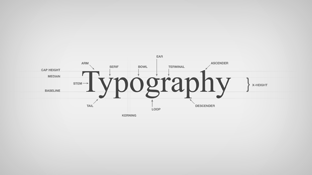
7 Do’s and Don’ts of Typography You Must Know

Like the selection of your logo or the color scheme on your website, typography also plays an integral role in making the right impact on the readers. A bad typography would fend off the readers from going any further, while a great typography can hook them right from the header of your web page or brochure for that matter.

Typography isn’t something that you can simply use on any material without giving any thoughts to its key mechanics. To tell you the truth, there’s a lot behind the working of a good typography than meets the eye. Continue Reading →
Standard

4 Tips to Remember When Shifting Your Brand to Your Business Stationery

As we’ve entered into the brand-conscious era, we’ve moved pass the point when basic information on a company’s stationeries would suffice. Today, companies have integrated their brand’s essence not only into their marketing collateral but stationery designs as well.

Regardless of how things are going paperless all thanks to the digital media, the need for business stationery can never be ignored. Therefore, it’s all the more important to have a company letterhead that reflects the company’s message, its serious attitude towards its brand. Continue Reading →

Standard

5 Famous Logos That Carry Creatively-Hidden Messages Within

Logos are the “speak-for-itself” identity that even at a single glance can relate to which brand it belongs to.

Some logos are churned out without given even an ounce of thought to its relation to the brand or its message. However, there are some – mostly the famous ones – that carry the brand’s message within. Often those messages are as lucidly illustrated as a sky, while sometimes they are so ingeniously camouflaged that you’d have to look twice or even thrice to see it. Continue Reading →

Standard

5 Design Tips for an Aesthetically-Professional Business Card

There’s an adage that you may have heard a lot of times, “don’t judge a book by its cover”. Indeed, you never know what interesting bits of content a book may possess until you read it through.

However, our mind doesn’t always work that way. After all, we’re human and we’ve the tendency to judge things or our fellow beings by their appearance. Likewise, in the sacred realm of business, looks matters, and that isn’t limited to shoes, three-piece suit or body gestures, but extends to business cards as well. Continue Reading →

Standard

4 Verbal Faux Pas Your Clients (Sincerely) Wish You Never Make

Communication plays a key role in not just our lives, but also in our business. It is said that verbal communication makes only 10% of the entire conversation, while the rest is your gesture or expressions.

However, what many fail to notice, at times, is that that 10% of verbal communication plays an integral part in either taking your business down to the very bottom of a sinkhole or helping it emerge out of one, as victorious. Continue Reading →

Standard

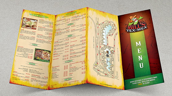
How Creative Menu Card Designs Impacting the Restaurant Industry

Creative designs tend to make a considerable impact on potential customers. However, what elements of creative designs do that magic isn’t related to appealing colors or patterns alone. There’s a whole psychology behind it that let you influence or manipulate the purchasing-decision of the consumers. And that magic isn’t limited to creative industries but extend far beyond to other realms as well, including the restaurant industry. Continue Reading →