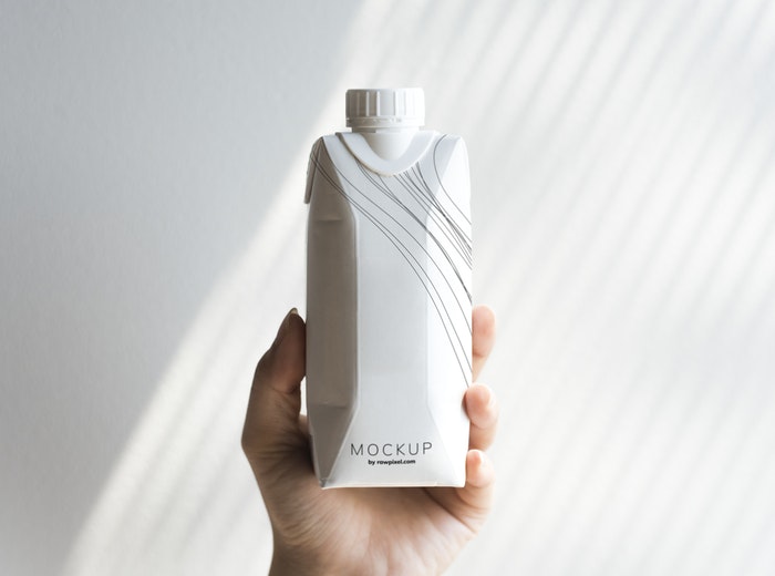
A product’s package is more than just a bag that holds the product. It is a tool through which customers can learn more about the product, including the product’s description, smell, shape, and more.
Product packaging design is really important to get some eyeballs on your product. When your product is on a shelf with other products, it is your package design that attracts customers. If your product’s package design is mediocre and generic, it will not have a good impression on your potential customers. In other words, the package design is the product’s first impression on your customers and the first impression can leave a lasting impression.
For a beginner, package designing can be overwhelming. It is not like other types of designing where you only have to focus on the looks. In package designing, designers also have to focus on its feel. Here are some tips that could make the process easier for a beginner.
Product, People and Place
Before getting into the design process, it is necessary to know more about the product, its consumers and where it will be sold or placed. A technological product and a fashion product will have different design and typography. A product for senior citizens will rely more on big text and images so it is easier for them to read. A product that is sold on a supermarket shelf must have a design that as little space as possible so more products can be stacked.
Branding
The product’s packaging design must be consistent with it overall brand image. This includes the color palette, typography, and logo. The packaging must follow the brand’s style guideline. However, there will be a slight difference in colors here. This is where CMYK comes in.
CMYK vs RGB
To design for the print medium, we have to use CMYK color mode. CMYK is cyan, magenta, yellow and key (black). Whereas for digital design work, RGB color mode is used, which is Red, Green and Blue. When designing for product packaging, make sure that your brand colors match the correct CMYK code so the end result looks exactly as you intended.
Dieline
Dieline is the flat layout of your package design. This template is usually created in a vector based tools in simple lines and shapes. Dieline consists of trim line, bleed line and safety line. Packaging design should extend to bleed line, which is the area beyond the trim line. Trim line is where printer cuts of the design. All the important text must be placed inside the safety line.
