Running a restaurant may seem like a fun thing. But, in reality, it is more than what an ordinary person perceives.
People who own restaurants, especially where they already have similar kind of other restaurants serving the same food, exactly know how difficult and complicated it is to maintain a reputation.
However, this digital age has reduced the pressure to some extent, if not eradicated completely.
If you have been implementing some traditional practices to stand out, then pause for a moment. And, think of giving your restaurant a solid online boost through its website.
This not so big investment will allow your restaurant to cater a large group of audience by establishing a brand. But, it all depends on how smart and intellectual you are as far as your website’s design is concerned. Therefore, we made sure to keep this process a little easier with these design hacks.
No matter if you are less aware of design technicalities, this guide will help you convey your thoughts to a professional.
- Understand Your Audience and their Preferences
First of all, instead of just targeting everyone, be selective and know who your audience really is.
For instance, if your restaurant is located near a business center, then you possibly have business executives and professionals as your audience. Now, keeping that particular aspect in mind, come up with a design that matches the mentality and behavior of your prospects.
- Entice them with Delectable Images
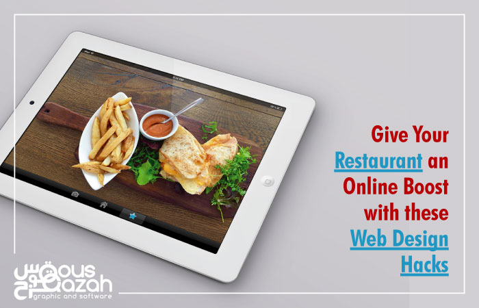
Of course, there is no reason of your website’s existence without having some really delectable images of your specialty. This is the feature that grasps all the attention right away and synthesizes what your restaurant is all about.
If possible, do professional photography that also introduces visitors with the atmosphere as these are a couple of significant factors to establish an unparalleled identity of your restaurant.
- Show What Your Restaurant Serves
When any one lands at your website, he should get a clear idea about what you actually serve by checking out your menu list and deals. But, it should be displayed in the easiest manner because an average website visitor takes max 2-3 seconds to decide whether he is going to stay or not.
It is simply useless to hide your menu behind irrelevant visuals as this is the crucial element that defines your restaurant’s theme and its wide range of food servings.
- Make a Purposeful Use of Colors
Colors make and break the mood!
So, because of that reason, make sure to incorporate a deliberate approach while picking up the colors. If you are a fast food restaurant, then your color selection should be made accordingly. On the other hand, if you are serving any specific type of cuisine, reflect its essence by adding relevant-themed colors to your web design.
