Alright, you have been asked by your creative head to design a billboard ad for one of the company’s prestigious clients. Also, he wants you to give your best shot as the client expects something cool, attention grabbing and completely out of the box.
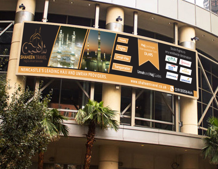
Well, this is the kind of situation that requires you to be incredibly creative, because making your design over crowded with unnecessary information will not do the magic. In fact, this approach will add your work to the same group of pathetic and conventional billboard designs that say a lot of crap.
So, keeping in view the need of the hour, we have mentioned and talked about a couple of PRO rules to help you design effectual billboards.
By applying such rules perfectly, we are sure that you will come up with a superior billboard design to meet your client’s expectation.
- Carefully Analyze the Location

First of all, you need to know about the location where your design will be displayed to its respective audiences. To be honest, it’s the most crucial aspect that many designers never care about.
With this little knowledge, you can bring in so much maturity, integrity and relevancy to your design. Therefore, we always stress upon this factor while designing billboards and signs for clients.
- Go Simple Yet Thought Provoking
The second rule that allows you to be excessively creative is adding simplicity. However, you should be doing it in a way that signifies a though provoking concept and give people a reason to stick around.
You can ask it to yourself though. Only billboard ads that are simple and supported with the relevant details to grasp become the center of attraction. So, why not implement the same design strategy to your own work?
- Portray One Message at a Time
This is where you should ask your client to provide with the splendid piece of content that engages well with a massive crowd and drive value.
Both technically and practically, billboard designs that interpret one message at a time have more power to influence the audience than the ones that are packed with irrelevant information.
Fonts have the strength to make your design super energetic and impactful. But, their usage greatly depends on the theme and type of design you are working on.
If you are designing for a fashion brand, make sure to select the fonts accordingly and same rule applies to all other design types for adding a killer effect to your billboard ad.
