User experience is an important aspect of delivering a design that is effective in accomplishing its purpose. If an interface is confusing for users or if it is unable to guide the flow of browsing for users, it will be unable to accomplish its purpose. For this reason, when designing a UI, it is important to think about how users will interact with it and how they can use it to complete their purpose. Continue Reading →
UX Tips for Highly Converting Pages
The goal of every business is to increase their worth, which is their primary focus is to earn a profit. The purpose of creating a website for a business is essentially the same as their overall goal, i.e. to gain leads or sales from it. However, getting sales or leads from a website is not just about how good your marketing tactics or products are. It is also about how good your website is for targeted users and how well it relates to their needs. This can be ensured by working on two main things: design and content. Continue Reading →
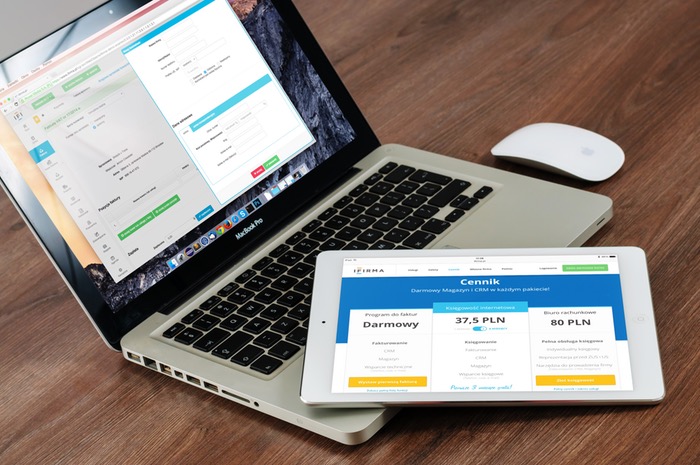
3 Results-Driven Tips to Design Order Page
For an e-commerce website, one of the biggest concern is cart abandonment. The problem is, potential buyers, add products to their carts, but they don’t proceed to the checkout page. There can be many reasons why users abandon the checkout process. It can be due to indecisive nature of users, it could be price or discount, but mostly it is due to the user experience on the checkout page.
When it comes to designing a checkout page, many e-commerce websites make the mistake of not optimizing the UI and UX of the checkout page. Tweaking UI and UX design of a checkout can easily improve the conversion rate and cart abandonment rate. Here are few tips in this regard. Continue Reading →
How we improved On-Site Search Results for Tech-Bazaar
If you own an e-commerce store, then ‘search’ definitely acts as an active salesperson that introduces your potential audiences with all the best deals and offers your store has got.
Unfortunately, a lot of UX experts and creative think tanks never think this way while designing an online store. But, if you want better conversions, you need to consider your store’s on-site search result as an integral element and make sure that it helps your customers find the desired products quite swiftly.
To make it happen, we thought to share some absolutely tested tips that are sure enough to improve the UX of on-site search results. We took for example Tech-Bazaar which is a refurbished laptops and computer selling company for whom we had made an e-commerce website take as an example
So, let’s explore some facts that define the main functions and selling points… Continue Reading →
4 Tips for Creating Remarkable Push Notifications
So, you have got an app. Sounds good!
You know that you are not the only one having an app, right? The app store is packed with thousands of apps, and there is a possibility that the type of app you own is not something new to the market.
The digital age has made everything so accessible to consumers, which push the service providers to innovate within their domains. However, there is an extremely vital component that can provide your audience with a very personalized experience through your app. And, that is none other than a “push notification”.
We thought to talk about this particular aspect in detail, and therefore some tips have been highlighted below. After incorporating all these proven tips in a perfect way, you will definitely be able to see a drastic improvement in terms of the response rate.
Let’s dive in… Continue Reading →
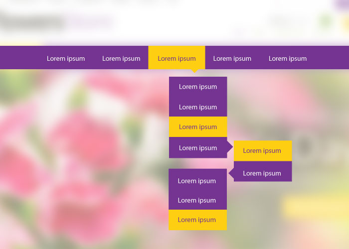
Practically Proven Ways for Designing Drop-Down Menus
We are always so much concern about the optimization of our websites so that they can rank remarkably on search engines.
The mentality is pretty nice and obvious, because if your website is not visible to the audience you are intending to cater, your efforts will go in vain. However, despite of having ranked on the top, if your website doesn’t offer an awesome user-experience, you will more likely to lose the attention of your prospects.
Your website should be able to guide your visitors and help them get what they have come for. This is where a drop-down menu can play a dynamic role. But unfortunately, majority of websites make this menu a little complicated to understand that ultimately distracts the prospects and force them to leave.
Here, you are going to learn practically proven ways for designing drop-down menus. We have made sure to enhance your grasp on this crucial component of a web design. As this way, you will definitely realize a dramatic change on the conversation rate of your website. Continue Reading →
What Your Hotel Website Needs for An Impressive UX Design?
Own a hotel?
Want to design a website that can offer an enthralling yet actionable user experience?
Well, congratulations, because not every hotel owner have similar thoughts like you. However, a remarkable user experience, especially through a hospitality website, is a big thing. And, to make it happen, you need to be technically sound.
You should aim to convert every legit visitor of your website into a potential customer. Practically, it is turning out to be an intimidating task because prospects are more sensible now and get attracted towards an offer that caters their needs in just the way they expect.
Therefore, keeping all such aspects in mind, we have jotted down some crucial elements that you should incorporate to your hotel website for an impressive UX design.
Let’s start with the first one. Continue Reading →
Best Practices of Designing Forms for Maximum Lead Conversion
A website acts more like a face that introduces your company to a wide range of audience and helps establish an impactful brand. With a remarkable website, you have all the power to connect with your prospects and assist them in finding solutions to their problems through your product or service.
Practically, everything I said above is achievable. But technically, there are a lot of factors that need to be considered. And, designing forms is certainly one of them.
Without having reasonable forms on your website, you can’t convert your prospects into potential buyers. So, this area should be given equal significance, and therefore we are going to share some best practices of designing forms, so that you can have maximum opportunities for massive conversions. Continue Reading →
4 UX Mistakes that Are Ruining Your Design
If you are a web designer, you certainly know how crucial it is to come up with a design that is favorable to your respective audience by all means.
But, most of the time, in order to do the best, we try to incorporate different ideas and assume them as the ultimate ways of guiding the users. In reality, all those efforts go in vain.
Have you ever thought about the UX steps that you imply for good, but in actual, they are turning to be the real destroyers of your design’s readability?
I think it is the right time to take them into consideration and look out for ways to fix all such issues for offering a robust experience to the end user. And trust me, this is what you are going to learn from here.
This blog comprises of four extremely gigantic UX mistakes that are negatively affecting your design and eventually offering a pathetic user experience. Continue Reading →
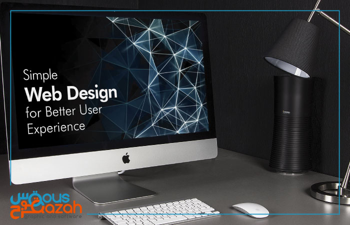
4 Tips to Simplify Web Design for Phenomenal User Experience
Most of the time, we get over conscious about web designs. In result, we try to incorporate a blend of so many intellectual design elements together for accentuating a completely user centric view of our websites. Unfortunately, the reality is, things doesn’t work out this way. While, on the other hand, a simple web design with all effective ingredients proves to be successful in terms of great user experience.
Well, it is the truth!
We use to discuss a lot about design, user experience and user interface through our blog. But, going simple in all aspects is what considered to be something difficult. Therefore, we have penned down some basic tips for web design simplification which will certainly make your website favorable from a user’s perspective. Continue Reading →


