Page 1
best-practices-for-newsletter-design
Standard

Let Your Newsletter Design Enthrall Your Leads with these Best Practices

If you are considering email newsletter as a conventional and less focused strategy to nurture leads and convert them into customers, then you are absolutely wrong.

Yes, emails and newsletters are still in the race and used amazingly to communicate with prospects and cater their needs with best of the best information. But, the fact is, this entire journey is greatly reliant on the design of your newsletter template.

The more appealing, intellectual and reader-centric the design of your newsletter is, the better chances you have to drive results out of it.

So, what are the key design elements that can make your newsletter an impactful bridge for getting a step closer to your prospects? Well, this is what we are going to reveal right here. Continue Reading →

tips-for-designing-about-us-page
Standard

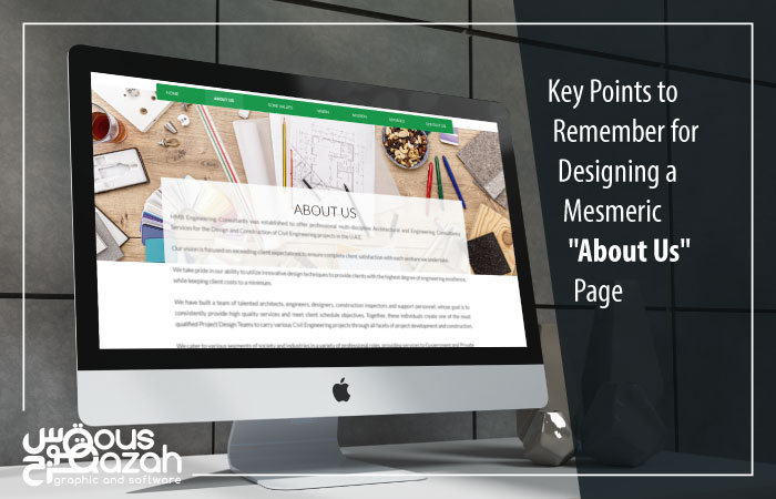
Key points to Remember for Designing a Mesmeric “About Us” Page

When it comes to designing a business website, each and every page holds its own significance. However, the “About Us” page tops the position as it is considered to be a primary gateway for your prospects to know more about you in the briefest manner.

It certainly means that underestimating the impact of this particular page will spoil your plans.

Alright, for a couple of minutes, think of yourself as a potential customer who has landed to a website to find a reasonable solution to his problems. And, what if you are welcomed with a typically pathetic content that only talks about the company, a poor design that uses stock images instead of the real ones, and most of all, the same conventional user experience?

Would you prefer spending time to this website? Of course, no! Continue Reading →

cta-buttons-that-convert
Standard

Insanely Awesome Ways to Design CTA Buttons that Convert

We talk a lot about design, its impacts on human behavior and conversion rates. Because in today’s customer-centric era, a satiating design is one of the significant elements that delight a prospect, and if it is blending in with the quality content, produces phenomenal results.

So, here we are going to talk about an integral part of a reader focused design, CTA (Call-to-Action).

CTA is a small button that does its magic if used in an appropriate way. But, do you know what these ways really are? Do you know how you can make an amazing use of your CTAs, so that they can drive incredible sales?

Well, this blog has the answer to all such questions. Continue Reading →

typography-tips-for-better-readability
Standard

Make Your Text Readable with these Striking Typography Principles

It’s true that pictures speak a thousand words, but sometimes in order to make such images more compelling, you have to take necessary majors, and this is where typography comes to play its part.

Typography is a key element to add authenticity and centricity to the content and gives an entirely new and fresh feel to a website. However, not everyone is proficient in making a right use of this incredible component. And therefore, we made sure to highlight some absolutely proven and striking typography principles to make your website’s text readable and completely visitors focused.

Let’s dive in. Continue Reading →

4-user-experience-tests-for-website-redesign
Standard

Redesigning a Website? 4 UX Tests You Should Do at All Costs

Are you planning to redesign your website because it looks so outdated?

The plan is certainly good, but requires you to be extremely creative, calculative and customer-centric to attain positive outcomes.

Coming up with a redesign plan is one thing, but making it successful demands effectiveness. And, this is what you will learn here.

In this blog, we have covered a couple of tested and absolutely proven website redesign tactics that will surely help you create a customized layout to treat your prospects in the best possible manner. Continue Reading →

Standard

Top 4 UX Design Trends of 2015-2016

UX (acronym of user experience) refers to the overall experience a user gets from a certain product, mostly used in the context of apps and technology. Trends can be seen in different trends of UX designs that are adapted and appreciated by a significant number of users, based upon which forecasts can be made about the design trends that might be favourable in the near future. Continue Reading →

Standard

An Interesting Correlation between the Two Distinct Components (Typography & User Experience) of an Ideal Design

You get a new project on your desk. You start with the framework of the design. Next, you get the logo designed as well as the website layout. You then move on to some specific components of the design like color scheme, navigation bar, a beautiful header or slider, etc. Once done, you move to the “Live” phase. That’s all you do in designing a typical website, right?

It is apparently quite common in the design industry that some designers tend to overlook the impact of User Experience (UX) on their website. The website they design although appears appealing, yet they see a huge decline or lack of visitors on it. This all happens when the UX of the website is bad, and one of the many things that lead to a bad UX is inappropriate typography. Continue Reading →