A logo design is not a brand and a brand is not a logo either. Rather, a logo is an identity of your brand, which is made up of a symbol, typography, and colors. Just like your identity never changes, brand identity remains consistent as well. There may be few changes to a logo design, but the essence of the original logo design always remains in the redesigned version.
A logo design doesn’t get revamped frequently. It only gets revamped when there is a major change in the brand or the design trends. One such trend that caused many brands to redesign their logos is a responsive design.
Just like we have a responsive web design that fits all types of screen sizes, we also have a responsive logo design that makes logo translatable to all screen sizes. Since mobiles and tablets are the most commonly used devices for browsing the internet, there is a need to make sure that your logo looks clear and recognizable on even small screen sizes.

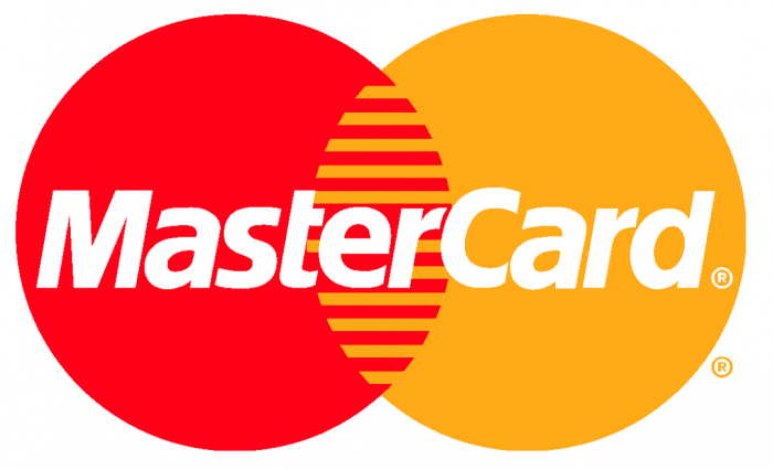
Some logo designs don’t look recognizable on small screen sizes, especially those that contain detailed visual elements. For example, this old MasterCard logo wouldn’t look good on small screen sizes, because the text would not be readable. This is the key to creating responsive logo designs.

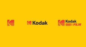
A logo is easily adaptable to different screen sizes when it contains limited visual elements. Even if there is a logo that has detailed visual elements, to make it responsive, we need to only pick up the most important element that represents logo and stick with it for smaller screen sizes. For example, Kodak logo can be made adaptable by removing details, like the typography and extra lines and sticking to the symbol only, which is the essence of its logo. This seemingly simple technique of turning a logo into responsive design takes a quite a lot of thinking.

There are mainly two types of logos: logotype and logomark. Logotype are those that contain typography, while logomark are those that only contain the symbol. However, most of the popular logo designs have both elements. These logos will still be recognizable if the typography or symbol is removed. This is what most brands do to make their logo designs responsive to different screen sizes. For example, Pepsi logo will still be recognizable if we only use the symbol.
Therefore, to convert a logo into a responsive design, decide whether to stick with the logotype or logomark, avoid extra details in the logo design and stick to the simplicity. Using these principles, any logo will look good on smaller screen sizes.
