We are always so much concern about the optimization of our websites so that they can rank remarkably on search engines.
The mentality is pretty nice and obvious, because if your website is not visible to the audience you are intending to cater, your efforts will go in vain. However, despite of having ranked on the top, if your website doesn’t offer an awesome user-experience, you will more likely to lose the attention of your prospects.
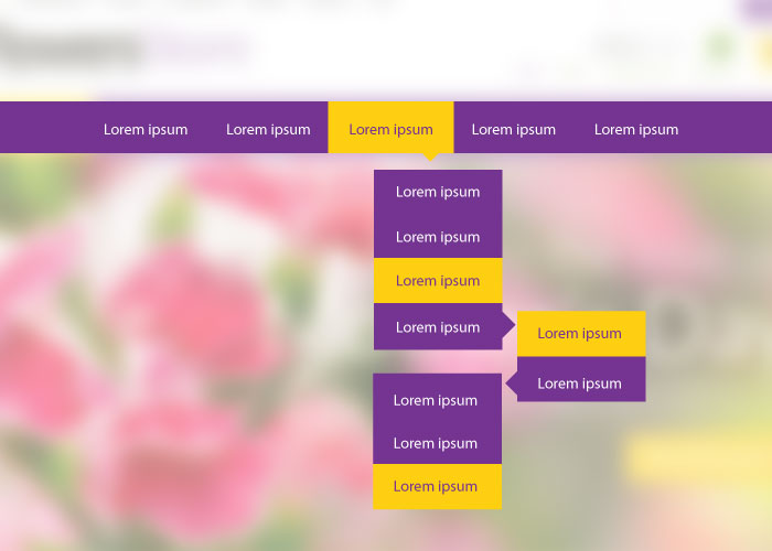
Your website should be able to guide your visitors and help them get what they have come for. This is where a drop-down menu can play a dynamic role. But unfortunately, majority of websites make this menu a little complicated to understand that ultimately distracts the prospects and force them to leave.
Here, you are going to learn practically proven ways for designing drop-down menus. We have made sure to enhance your grasp on this crucial component of a web design. As this way, you will definitely realize a dramatic change on the conversation rate of your website.
- Use Clear Headings to Group All Related Sets
One of the core purposes of designing this menu is to signify a large range of links in their respective sets. So, to let users know that which links fall into related sets, it is important to use headings to group them together.
And why not? Keeping the drop-down menu simple by grouping related links will take your visitors to the desired page.
- Follow a Standard Yet User-Centric Style
Again, if the visitors of your website are not comfortable after they land, they will move on, and this is something you don’t want to happen, right? Therefore, be user-centric with your approach and imply the techniques that are more favorable to your potential customers.
The most ideal place to use drop-down is header. Because, once your prospect visits your site, he needs to know about your company and the services it offers. And, this is where a perfect drop-down can do the job.
- Visualize Your Best Sellers
Let your audience know what you are good at by showcasing a glimpse of it in this mega menu. This way, you will be saving their time and increasing your chances for converting a potential visitor into lead.
- Smooth Transitions
Having clutter in your design can only distract you audience and make things less interesting. It is due to the reason you need to make sure that the menu opens up instantly when someone hovers over it.
Remember, a smooth transition is the win-win situation because it improves the efficiency of your drop-down menu and helps a user take the desired action in no time.
